Form Builder Components

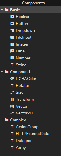
Components are building blocks to help you create and customize your data-driven content. For more details, please visit the Zero Density Academy on https://academy.zerodensity.tv/
Component Toolbar

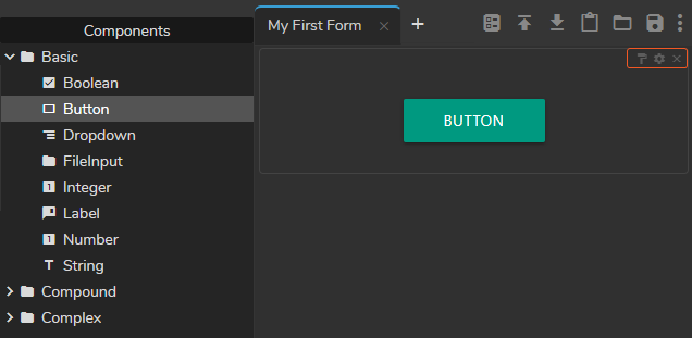
Except for the Action Group component, all other components share the same buttons as shown in the image above. From left to right, component buttons represent:
- Copy Style allows you to copy and paste the current style into the compatible component. Single clicking on the style button turns it to blue and allows you to paste the style once. Double-clicking on the style button turns it red and lets you paste your style multiple times. To finish the multiple-paste operation, you must click on the Copy Style icon one more time.
- Field Settings opens the component setting menu. In the field setting area, you can change component-specific settings.
- Delete button erases the component from the Form Area
Binding Info
If you drag and drop bounded properties/functions or components inside the Form Area, you can see its binding info on the component, as shown in the image above.
- Binding info of the
Playbutton: Animation Control~Play/Stop Ball Animation//PLAY/0 - Binding info of the
Stopbutton: Animation Control~Play/Stop Ball Animation//STOP/0

The image above shows the origin of binding info:
- Animation Control (Actor Name)
- Play/Stop Ball Animation (Property Group Name)
- Play (Button Name)